DESCRIPTION WORKSHOP
How to improve your card’s look and game play mechanics through the simplicity of editing words!
- Introduction
- The Three-Step Program to Rehabilitate your Description!
- Game Mechanics – Simpler is Better
- Correct Formatting and Font – IS THIS RIGHT?
- Cutting the Fat – Because Grizzle is just flavor
- Examples
- Questions/Improvements to the Workshop
- Post Your Cards for Editing!
INTRODUCTIONIn short, this is a small workshop to help those card ideas that seem to be a little wordy (or vague) with their descriptions. 'H2T' is a term known as 'Head to Toe' in the fashion industry, and you can say that if the card art is the face, then the description is the remaining body of the card. {Yes, I know it's silly, but let's go on}
Think your card idea is ready to head up to the Crucible? While I’ve seen many card ideas (probably not as many as the Curator lord himself), some of them seem to have either too many words to possibly fit on an implemented card, while others have descriptions that simply lower the card’s overall quality (bad spelling/grammar, awkward sentences, irregular formatting, etc.). Either way, even though your card isn’t going to make you an awesome card designer for Elements, think of each card as a résumé.
Résumés (cards) need to have a professional look in order to grab the attention of perspective employers or colleagues (the card curator/lead developer and the community). Not everyone is going to have perfect spelling or an extensive vocabulary, but having an elegant description displayed on your card that is concise and true to what your card does is always a major advantage over cards that fail to do so.
(Note: Of course, having the correct table and format will only propel your idea into the crucible after being looked over – if you can’t fill out the table as assigned her for organizational purposes, then your card won’t be accepted period.)
With that said, I present to you the Three-Step Program.
THE THREE-STEP PROGRAM TO REHABILITATE YOUR DESCRIPTION!
There are three ways to help make your description easier to understand, which can be explained through the three (3) ‘C’s’:
Content, Configuration, and Conciseness.
GAME MECHANICS - SIMPLER IS BETTERContentThe most important aspect of a card is its content – ignoring the artwork, whether it’s a spell or creature, if it’s a rare or bazaar card, etc. No matter what card is posted first into the Smithy (or main Card Ideas and Art section), the description is going to be the bulk of what people are going to be looking at. Without that description (or with a poorly written one), you can ensure that your card has a higher chance of being ignored or questioned by the community.
Creativity should never be limited by words, but at the same time, you have to be practical when it comes down to creating a card. Writing multiple paragraphs in that tiny card text box is wonderful, but at the same time detrimental in the sense that onlookers would detest how it would be implemented. Remember, if the lead developers decide or want to use your card idea,
less is more. The more you have on a card, the more likely parts of the card are going to be cut to favor a more simpler mechanic – they may also just remove your mechanic altogether in case it’s just too complicated.
Minor example of a random creature with an ability:
“Generates

each turn.â€
“Whenever you play a non-water creature, gain 1

immediately, and change the creature you played into a water or neutral creature until you spend

, where this creature gains a bonus in attack equal to the amount of

you spend for X turns, where X is the number of water creatures you have on the field.â€
Out of the two of these, the second one is more interesting, but seems overly complex compared to the first one. The first one is indeed unoriginal, but is easy to understand right from the get-go. Also, the second card’s mechanics can be separated into other cards, which brings up an important rule of thumb:
If you card’s description can be separated onto different cards, your mechanic is most likely too complicated.
CORRECT FORMATTING AND FONT – IS THIS RIGHT?
ConfigurationThere are three (
http://elementscommunity.org/forum/index.php/topic,891.0.html) threads (
http://elementscommunity.org/forum/index.php/topic,2632.0.html) that can help you produce a card image for your fantastic idea, but only one (
http://elementscommunity.org/forum/index.php/topic,7251.0.html) of them has the correct font from the get go. The +correct font is Gill Sans MT for the description*.
* = For the Stat numbers (if your card is a creature) and the card’s # cost, the correct font is Dauphin.
+ = You can choose to use other fonts if you want, as long as they're still readable, not overly fancy, and of an appropriate size.
You can find both of the downloadable links here (
http://elementscommunity.org/forum/index.php/topic,891.0.html).
'Configuration' is vital for a card, because the cards nowadays need to have a somewhat uniform look. It’s important to note that yes, there are a lot of cards in the crucible, forge, and even the armory that have different fonts for their descriptions. However, their ideas are short enough that if implemented, the description would simply require a few minor edits to remove or change a few words around to make it fit onto the card. Having the correct font size also helps players; in front of some computer screens, squinting is detrimental to our vision,
so make sure your words are at least 16-point font with the corrected fonts for the Pixlr editing program (or 10 if you choose Photoshop, before boating it). Planplan’s card builder has the correct font.
Size matters.No matter what Card Template program you use though, remember to put the image of the card in the table. Cards don't have to be exactly like the ones found in-game in terms of perfectly-matching formats (i.e. - if your words or margin spacing is off, don't freak out about it).
Small summary of this section is that you need to have at LEAST a 16-pt font for the player to see clearly (when the card is shrunken to a normal sized version), and try to use Gills Sans MT font whenever possible (if the template you have doesn't provide it, you can still post it, but it should be edited if possible with it).
This brings us to the final point of this process.
CUTTING THE FAT – BECAUSE GRIZZLE IS JUST FLAVORConcisenessThe last aspect of a card is how concise you can format it to make it so that all of the words can fit into that small box without compromising the clarity. Using shorter (or elaborate) words to replace others can help with spacing issues, and give you perspective on the layout of the card itself.
This is the section where most people have problems. Instead of finding creative ways to reorganize or exchange words, they instead cramp in as many words as they can by shrinking the text (now they’re not following the previous step(s)).
For this section, here’s a list of Do’s and Don’ts when it comes down to making a card more concise:
DO:- Avoid using ridiculous or long words that are more flavorful than clarifying. Extirpate vs. kill, use vs. utilize, parturitate vs. create/generate for example
- Make sure that you have adequate spacing between lines and a ‘margin’ between the edge of the text box and your sentences
- Switch from “passive voice†to a more ‘active voice’ for cards with abilities to make it clear to the player/reader about what they do. Passive voice sentences are generally longer than their active counterparts, and take up more space than necessary.
- Keep punctuation that helps separate parts.
- USE MULTIPLE SENTENCES IF YOU NEED TO! ‘And’, ‘Or’, and other conjunctions can take up more space in a card than just ending it with a period and starting another sentence.
- Check your spelling and grammar. People will usually help you out by correcting a mistake here and there, but if your card description is incoherent, then most people wouldn't know where to start for your idea.
- Aim for 3 or less lines of text and do not use more than 5. If your text is too long it will never make the game for that reason. (Kael Hate)
DON’T:- Remove a section of words just because you want the description to fit on the card. Your idea may be allowed into the crucible now that the description is correctly aligned, but your original mechanic is now either misinterpreted or completely different from what you had. Assuming you did the first two steps correctly, this final step should be a check on what words can be left out and what sentences can be swapped around. If you're still forcing yourself to remove chunks of the description after tweaking the mechanics and format, then something needs to be adjusted in one of the previous steps.
- Center the text of the card’s ability name. Everything needs to be aligned from left-to-right.
- Have different descriptions for your upgraded and non-upgraded cards if you can afford to. If the cost/creature’s stats are the only things that change when upgraded, the ability description should stay the same in both card images.
- Use acronyms. They just look tacky.
...and with that, congratulations! If your card passed all three of these steps, then your description is most likely already perfect or at a place where the curator and other veterans/'noobs' can read and appreciate your card.
Now about that card art...
EXAMPLESHere are a few examples on how to apply the above steps to cards you may see in the forum-
Example 1:
LIGHTNING BOLT | LIGHTNING BOLT

One from the Card Ideas Level 0 - Smithy section. The mechanic appears to be simple and it fits on the card fine, but the problem is that if this art was shrunk down to normal, the description would be pretty difficult to read. The words are pretty small as is - if we try to use the correct formatting, we get this (using the non-upgraded version as an example):

Disregarding the misspelling of 'flooding', it's apparent that the description can't fit into the card. Whether it's a matter of mechanics or simply wordiness, we can still fix this by going to the Content or Conciseness of the card. The following two cards (left side) are fixed versions of Lightning Bolt, with the first one focusing on simplifying the mechanic, while the latter tries its best to make the description as concise as possible.

 VS.
VS. 
Which cards 'look' better? The ones on the left, or the one on the right?
Example 2:
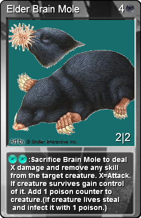
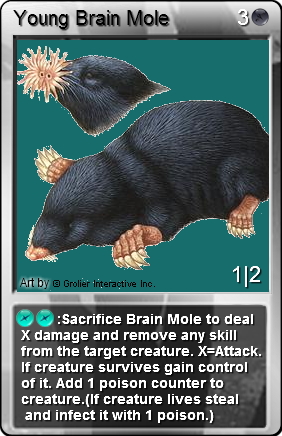
ELDER BRAIN MOLE | YOUNG BRAIN MOLE

Another idea on the Level 0 - Smithy Card Ideas & Art Section. The description is severely cramped into the space provided - while the ability itself is fairly unique and seems interesting, there's just too much going on. Cutting out a few words wouldn't help - here, we have to go directly to the content of the card and possibly remove a few mechanics. (Note: Game balance aside, it's easier to analyze a card with one or two abilities rather than having a plethora of skills activated on a trigger, as the ability 'Sacrifice' shows)
Using only the non-upgraded card, let's simply remove the 'remove any skill' (or Lobotomize) part from the creature and see where that takes us:

This gives us something to work with. From here, we can adjust the font type and size to the correct format configuration, and (getting a little ahead of ourselves) also remove the part in parenthesis, knowing that there might be a way to simplify the description further to explain the 'Stealing' mechanic.

The following remains:
"Sacrifice Brain Mole to deal
X damage. X=Attack. If creature
survives gain control of it. Add 1
poison counter to creature.
It's still spilling over the edges, and the ability name needs to have its own separate line. With a little bit of creative editing, we can choose to format it with the following:
""


: Sacrifice
Deals its damage to, takes
control of, and infects target
creature."
Note that 'Sacrifice' and 'infect' are defined game terms (See Unstable Gas/Immolation and Plague for example).
 VS.
VS. 
Which card 'looks' better? The one on the left, or the one on the right?
QUESTIONS/IMPROVEMENTS TO THE WORKSHOPFeel free to provide any feedback/questions/suggestions/
insults regarding this workshop, and post any cards that you feel are in need of a fine-tuning in terms of its description!
Edit: (props and credit also to Kael Hate for fixing this workshop)
Otherwise, thanks again for reading, and good luck with the design process of creating new monsters, items, or flashy spells to own your opponents with!


