*Author

A revision of the PvP screen https://elementscommunity.org/forum/index.php?topic=20025.msg253909#msg253909
« on: January 22, 2011, 04:28:44 am »
I'd like to start by saying that Elements is an elegantly designed game all the way from the card art to the game mechanics to the graphic interface. I've been playing for a year and a half and I have seen the game go through many amazing additions and improvements. However, the design of the PvP screen is one thing that still needs a little fixing.

The current pvp screen:
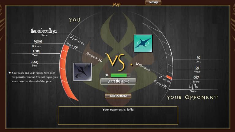
The current PvP screen has a kind of yin-yang feel to it. Your stats, are listed top-down along the left side and your opponent's stats are listed bottom-up along the right side. This makes it very hard to directly compare your two stats. Your eye has to cross the center (through text and graphics) before it can see your opponent's equivalent stat. This is often not easy to do in the few seconds before the game starts.

How your eye moves:
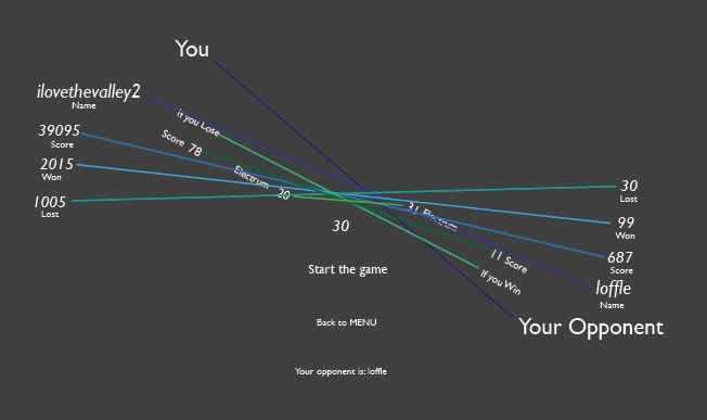
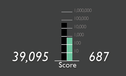
By placing the stats side by side it becomes easier to directly compare the information. I don't understand the meaning of red bar that goes around the circle. It appears that the bar's height is some relative comparison of the two players' score. However, the scaling is not clear. A better graphical representation of the score may be a logarithmic bar graph. For example, my score is 39,000 and log10(39,000) = 4.59 (or equivalently 104.59 = 39,000), which is represented by about 4.6 bar units high. My opponent's score of 687 is represented by a bar 2.8 units high (log10(687) = 2.84).

Comparing scores:

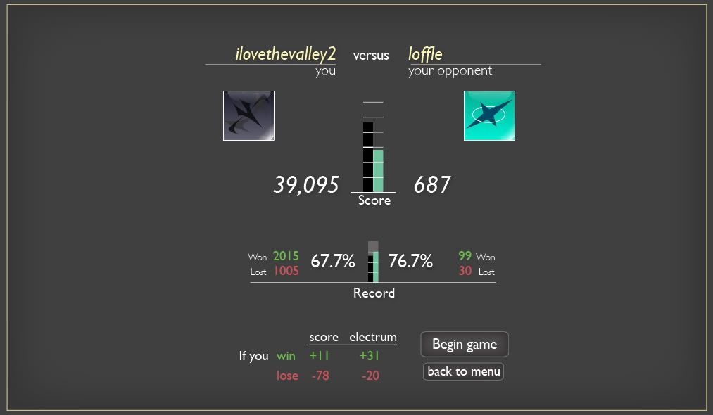
As with the scores, placing the players' records side by side also makes it easier to compare.

Comparing records:

By placing the win/lose outcomes into a simple table, the score and electrum that can be gained or lost is more easily read.

Win/lose outcomes:

This is my idea of what a better PvP screen could look like. It needs some decoration and perhaps some layout changes. Please let me know what you think.

A revised PvP screen:


Offline icecoldbro

  • Hero Member
  • *****
  • Posts: 1530
  • Reputation Power: 0
  • icecoldbro hides under a Cloak.
  • S
Re: A revision of the PvP screen https://elementscommunity.org/forum/index.php?topic=20025.msg253910#msg253910
« Reply #1 on: January 22, 2011, 04:32:07 am »
Im just a fool, but i do think it looks better, this new way and makes it easier to see if he's even worth playing
Id reccomend a watermark skeleton in backround

Offline Ekki

  • Hero Member
  • *****
  • Posts: 1425
  • Country: ar
  • Reputation Power: 0
  • Ekki is a Spark waiting for a buff.
  • Not-so-young Elemental
Re: A revision of the PvP screen https://elementscommunity.org/forum/index.php?topic=20025.msg253919#msg253919
« Reply #2 on: January 22, 2011, 04:40:19 am »
Wow, I always wanted to do a post like this (I always have problems with the PvP screen), but this one is great.

Back on topic. Truely, it's quite annoying to have all that information and not being able to compare it. Maybe there could be a way of keeping the ying-yang-ish look while fixing the other problem. Even though, the idea you proposed is a good starting point, I like it. Maybe with a few edits it will look awesome.

Re: A revision of the PvP screen https://elementscommunity.org/forum/index.php?topic=20025.msg253953#msg253953
« Reply #3 on: January 22, 2011, 05:08:27 am »
In my opinion, this view seems too scientific. I don't especially like the idea of win percentages being shown. I like the bit of ambiguity in the numbers and the chart, to me it just fits with the theme of the game. But the whole idea of putting win/loss statistics right next to each other seems to take away from the supposed impact of actually winning or losing a duel.

However, you make a lot of good points (It helps that you're designs are done well). I have never really had a problem with the current layout (Brief look at the red bars are all I need to see - but that's personal preference), so I might be coming across slightly negatively here.

I'm thinking this layout would still be an improvement if we lost some of the 'scientific' feel to it, yet still making it easy to read. I'm thinking spacing it out would get that effect (and obviously the artwork and polish). Maybe some subtleties in the layout to make it more mysterious, but as for those I have no ideas.

Good work!

Offline catalyzeme

  • Full Member
  • ***
  • Posts: 337
  • Reputation Power: 0
  • catalyzeme is a Spark waiting for a buff.
  • New to Elements
  • Awards: War #3 Winner - Team Fire
Re: A revision of the PvP screen https://elementscommunity.org/forum/index.php?topic=20025.msg254052#msg254052
« Reply #4 on: January 22, 2011, 10:29:38 am »
In my opinion, this view seems too scientific.
I can see this point, but I disagree, aside from changes that would be obvious (correct font and background, which I'm sure the OP just didn't include because they aren't necessary to make the point). I love the OP's ideas and I would love to see an easier to read screen. I think the one he made is excellent. The clearly labeled, vertical log scale is especially nice. I think the current scale is pretty useless. Keeping everything level is a great idea too. +karma for your first post, OP, I think this is great work.

Re: A revision of the PvP screen https://elementscommunity.org/forum/index.php?topic=20025.msg254636#msg254636
« Reply #5 on: January 22, 2011, 11:22:58 pm »
In my opinion, this view seems too scientific.
I can see where you get that. What about this?

If the difference between two players' score is less than a factor of ten it's called an even matchup.
If the difference is between a factor of 10 and a factor of 100 someone is labeled the favorite and the other is the underdog.
If the difference is between 100x and 1000x then the labels could be more extreme like the sure bet vs. the longshot.

You could probably come up with some better names for these things, but the idea is to translate the difference in scores in a more qualitative way for the non-scientific people.

Thanks for the positive responses everyone. But I don't really intend on doing any more work on the PvP layout/design. I just wanted to put it out there so zanz or whoever could implement it if they like. If anyone wants the layered PDF created in Adobe Illustrator, message me and I can send it to you.

Re: A revision of the PvP screen https://elementscommunity.org/forum/index.php?topic=20025.msg256379#msg256379
« Reply #6 on: January 24, 2011, 07:37:29 pm »
I can see where you get that. What about this?

If the difference between two players' score is less than a factor of ten it's called an even matchup.
If the difference is between a factor of 10 and a factor of 100 someone is labeled the favorite and the other is the underdog.
If the difference is between 100x and 1000x then the labels could be more extreme like the sure bet vs. the longshot.

You could probably come up with some better names for these things, but the idea is to translate the difference in scores in a more qualitative way for the non-scientific people.

Thanks for the positive responses everyone. But I don't really intend on doing any more work on the PvP layout/design. I just wanted to put it out there so zanz or whoever could implement it if they like. If anyone wants the layered PDF created in Adobe Illustrator, message me and I can send it to you.
I like this idea much more. It's unspecific enough that a casual player will get the message, but it makes sense. For the people who prefer words to graphs, it would work.
'Underdog' and 'favourite' both seem pretty positive to me (I always root the underdog), but 'the longshot' and 'the sure bet' seem less...happy.  However the names would probably be changed if it did ever get implemented.
(Another possible system would be doing the 'naming' off of score , 500-2000 = Adept, 100000 - 300000 = Pro or a generic system like that, but hopefully in that case the score would be modified for PvP - otherwise your system of direct comparison is much better)

You've done well, it looks good.


anything
blarg: